Homeland Security
Problem: Exhausting navigation, Not mobile friendly, dated images, too much text
Solution: Simplify navigation, create user friendly pages, help users navigate quickly to desired pages, Use engaging images, decrease text
My Role: UX Researcher / UX Developer / Independent Project
Tools Used: Figma, Adobe XD, Miro
User Persona
Usability Testing
Redline of Home Page
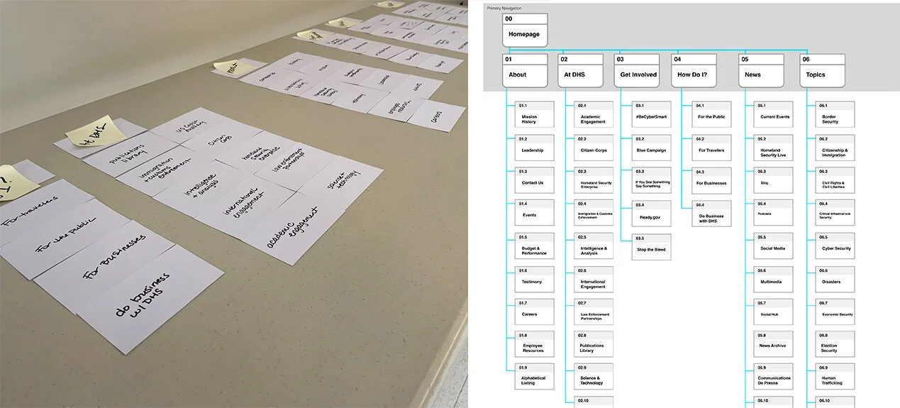
Card Sorting & Sitemap
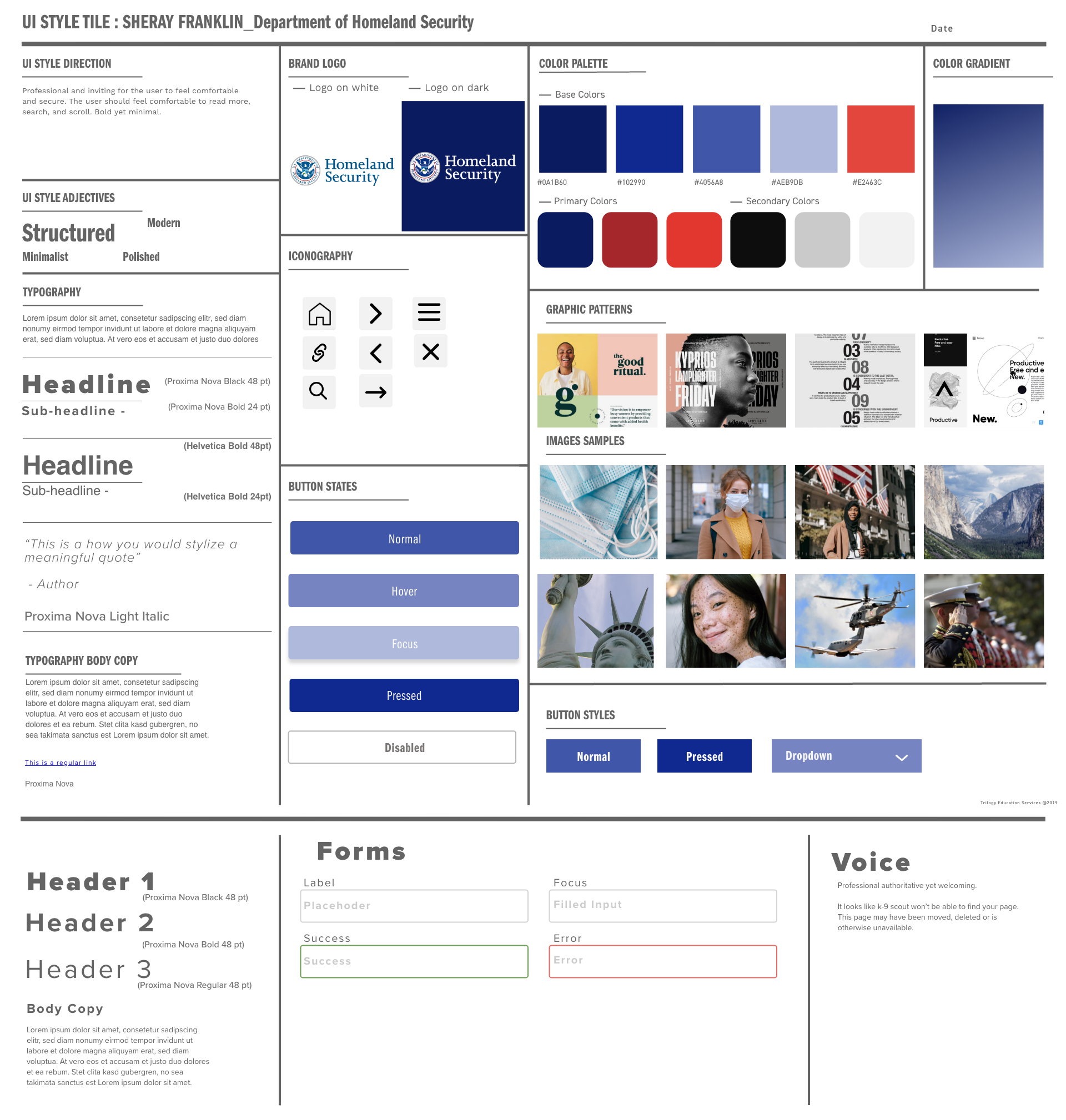
Style Tile
Clickable Prototype
“Clean, straightforward, easy on the eyes, legible, clean corporate look and feel, nice and simple navigation” -User Feedback
High Fidelity User Testing
Key Learnings & Takeaways
Iterate and then Iterate some more
User testing is crucial—sometimes I’m too close to the project to notice
Enjoy the process
Know your why
Components are your friend use them often


